Rolling out Salesforce is only the first step. Real value comes from adoption—the kind where users actively engage with the platform, data stays clean, and workflows run like clockwork.
But how do you know if it’s actually working?
Adoption Dashboards give you a data-backed view of how your team is using Salesforce, where friction exists, and what changes are needed. They help you move from guesswork to informed decisions.
🎯 Why You Need Adoption Dashboards
Too often, Salesforce usage is assumed rather than measured. But lack of visibility can mask deeper issues:
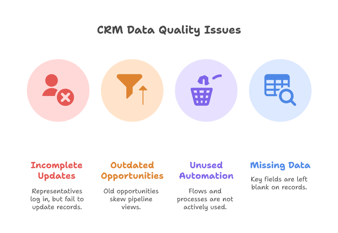
Reps logging in but not updating records
Outdated opportunities distorting pipeline views
Flows or processes no one uses
Key fields left blank on critical records
Adoption dashboards surface these issues early—before they start affecting performance, reporting accuracy, or team morale.

📊 Key Metrics to Track in an Adoption Dashboard
Here’s what to measure if you want a real pulse on how your org is using Salesforce:
👥 User Activity
Logins per user / per week
Last login date
Time in Salesforce (approximate with custom tracking or tools)
This tells you who’s engaged—and who might need a nudge or extra support.

📁 Record Interaction
Opportunities created/updated by user
Leads converted
Contacts created or edited
Cases resolved or escalated
These reveal how actively users are managing core business objects.
🧹 Data Quality
% of records missing required fields (e.g., Industry, Stage, Close Date)
Duplicate rate on Leads/Contacts
Overdue tasks or activities
Clean data is a direct signal of user discipline—and ease of use.
⚙️ Process Usage
Flow interviews triggered
Approvals submitted
Custom button clicks / record actions (using tracking fields)
These show whether key automations and processes are being used as intended.
📈 Pipeline Hygiene
Opportunities with no next step
Stale deals (e.g., untouched for 30+ days)
Opportunities past close date with open status
Healthy pipeline = healthy adoption.
📁 Recommended Dashboards to Build
You don’t need dozens of charts—just the right ones:
1. User Engagement Dashboard
Active users this month
Inactive users (last login > X days)
Login frequency by profile or role
2. Opportunity Management Dashboard
Opportunities updated this week
Open Opps with missing fields
Pipeline by last activity date
3. Lead & Contact Hygiene Dashboard
Leads with missing status or source
Duplicate Leads or Contacts
Lead conversion rate by user
4. Case & Service Dashboard
Open cases by agent
Case closure rate
% of cases with CSAT submitted
5. Automation Usage Dashboard
Flow executions (per flow, per user)
Process Builder/Flow errors
Most/least used guided screen flows

🧠 Final Thought
Adoption isn't a guessing game—it’s a metric you can (and should) manage.
The right dashboards not only show you what’s happening, they spark the conversations that lead to better training, cleaner processes, and smarter automation. If you're serious about Salesforce success, start measuring how people actually use the system—and let the data drive your next move.